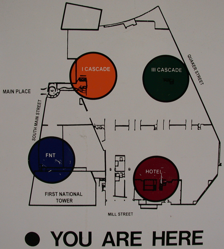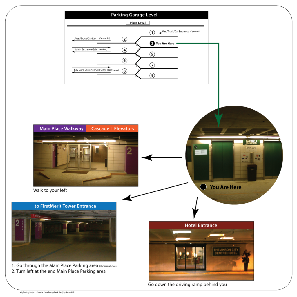
Old sign

My new version
Project Background
Have you been lost in a parking garage? Well, this project was to eliminate this in one particular parking structure. It involves field observational research, talking with people, and designing and testing cycles to produce better map environmental signs and wayfinding cues. My goal is to improve navigation within the parking garage.
The Problem
The poorly communicated signs and wayfinding leave many people needing clarification. I know this from many years of observing and helping random people locate their vehicles and pointing to or walking them to their destination. My favorite question from people is: “Where is my car?” And my reply is: “I don’t know, what area did you park it in?” followed by questions like:
-
-
- Where did you enter the garage?
- Where were you just at?
- What items do you remember seeing?
-
About the Garage
The parking garage is a five-story underground structure that serves the buildings above the plaza and the surrounding area. The walls inside the parking garage have street names painted on them, which helps tell people where they are. Still, there needs to be an indication of whether the street names on the walls are art or for orienting oneself. Also, unless you park near one of the outside walls, you will never see the street names on the wall.
You will find a sign with a map when you enter the garage off to the side, which no one looks at, and by the elevators. The map shows the area with the street names outlining the plaza area. The creator uses transparent color coding, an excellent technique, to mark the different places on the map. The colors on the map match those found in different parking garage sections and levels. At this point, the map looks like others you have seen using the same techniques yet still lacks communication.
One problem with the map is the big “• YOU ARE HERE.” It is prominent and easy to read, but where is it on the map outside of being written across the bottom in large type? I will let you know it is not there so you don’t have eye strain trying to find it. This major orienting starting point cue for understanding where they are compared to other areas is lost. Besides adding it to the map, it would be great if it indicated which direction you are looking and not that you are a dot, inside or next to another big colored dot.
The last issue I will mention is that once you enter the parking garage, there is no indication of where you are as to the plaza above when you go to the park. All you see are up-and-down ramps and color-coded pillars with numbers on them. So, until you park and go to one of these maps, you have no idea where your final location above is. The creator seems like they tried to make things easy but skipped testing or experiencing navigating the structure.
My solution
My solution was to create a new sign with more clarity of information from the viewer’s perspective. It took advantage of the garage’s current color coding and eliminated the split-level numbering system. I hung a printed version of the sign next to the old sign and observed and polled people on which sign was more helpful. I even emailed people visiting my office the sign as part of the test. The test results were overwhelmingly positive, and I shared them with the parking garage company. Two items to point out about my design are that the map signs are different based on a person’s location, which would be some increased costs as you cannot just print forty of the same signs. Also, the installation requires the installer to place each sign in the correct location.
